
The Wandering Donut
A community fueled food truck
Objective
The Wandering Donut stands for something distinct in a world where everything happens at a breakneck rate, leaving individuals feeling estranged from one another. We firmly believe that the ability to unite people through hard work, community, and tasty, freshly baked donuts. The Wandering Donut understands the value of bringing people together and building a community space. After the pandemic, the business needed to readjust its business plan and location to combat the sudden economic shift.
Solution
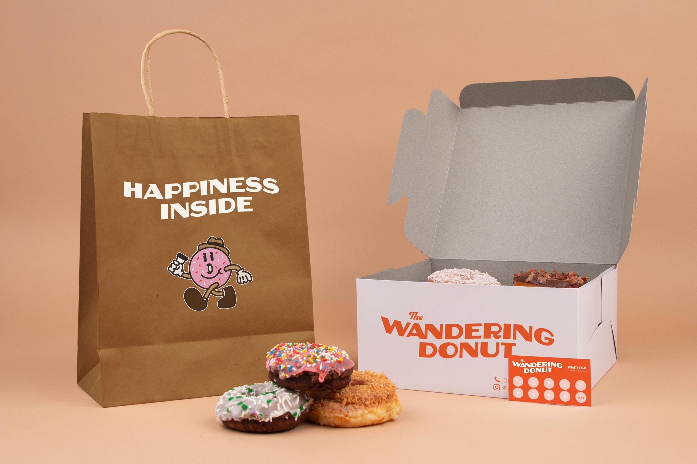
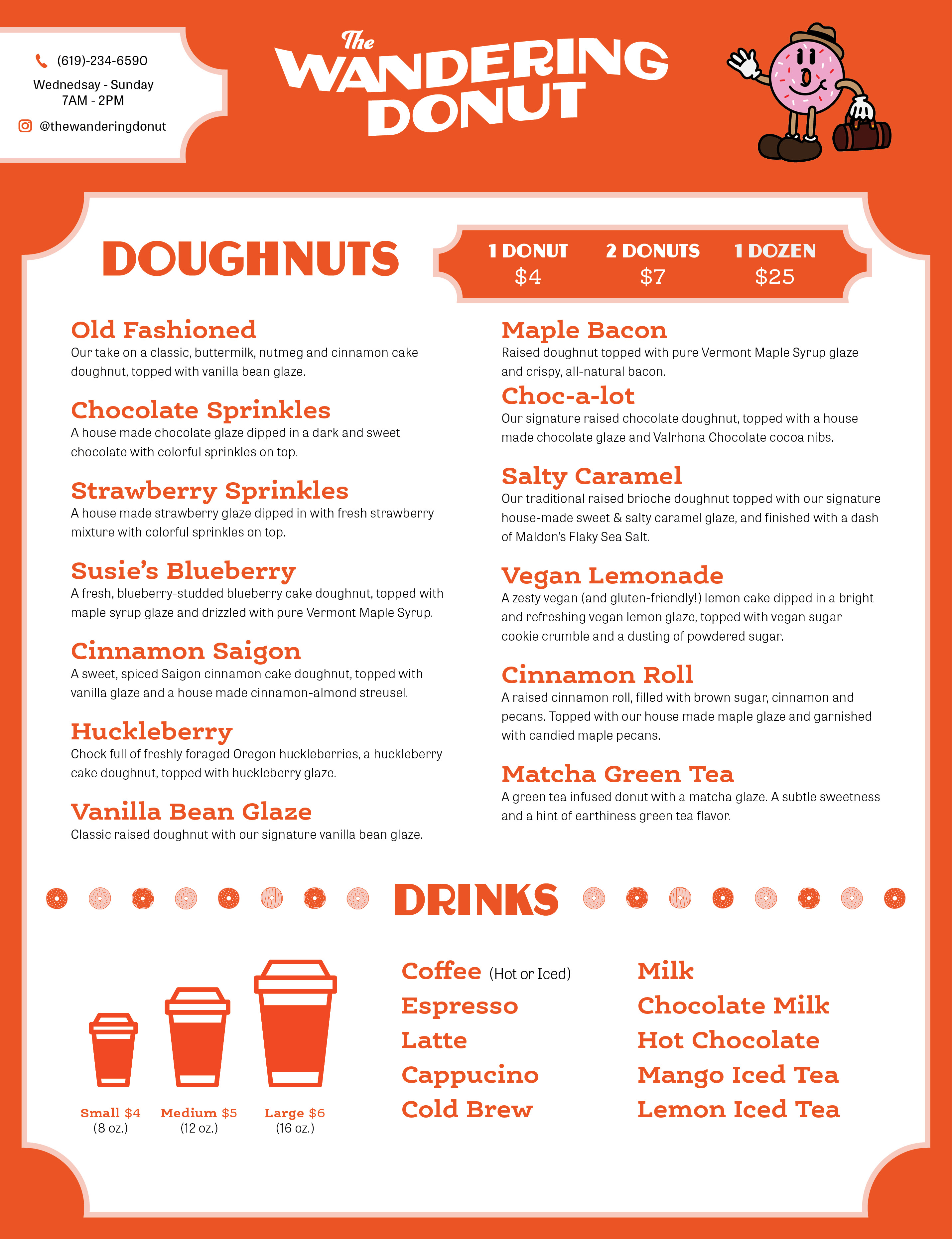
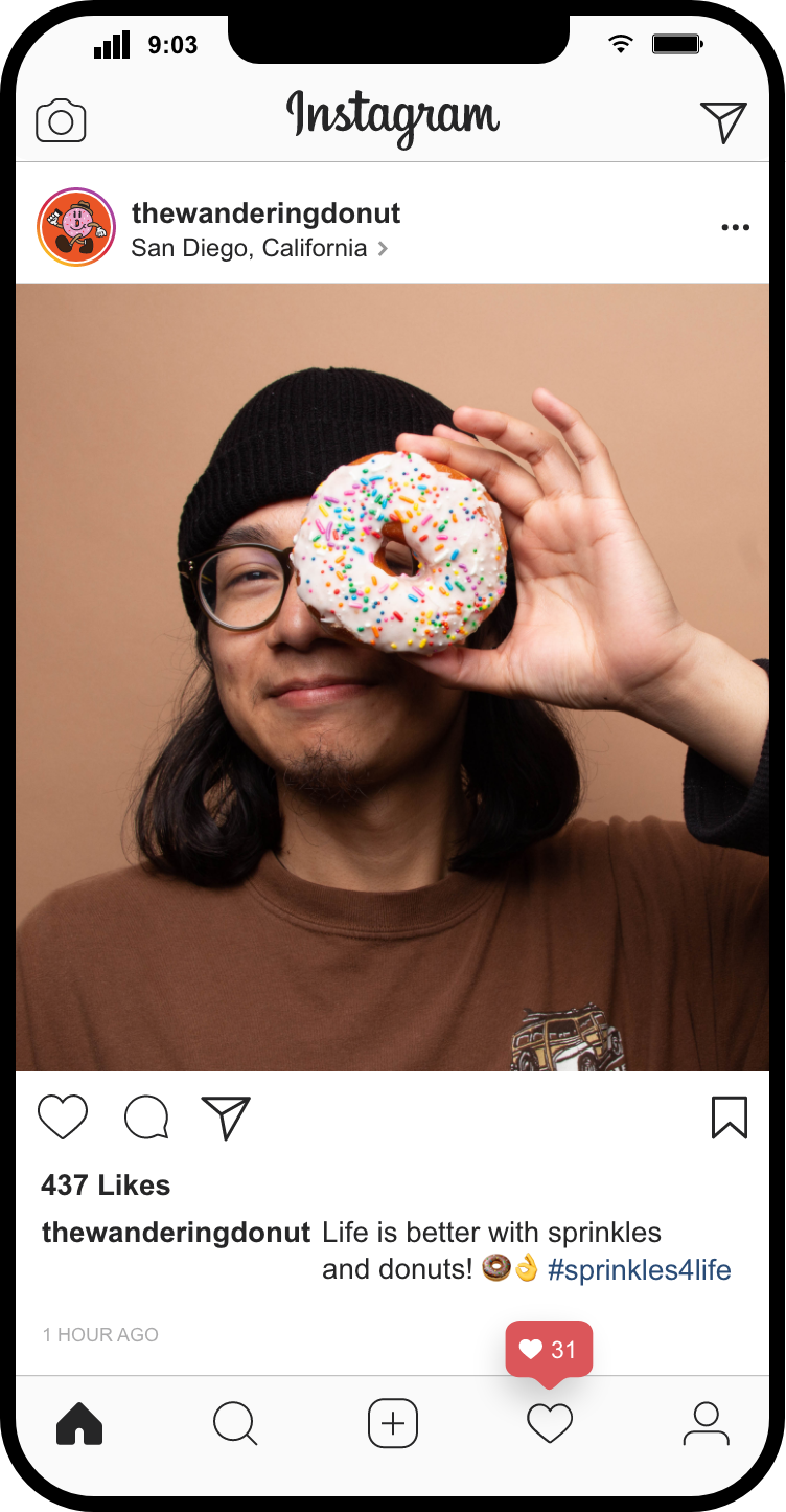
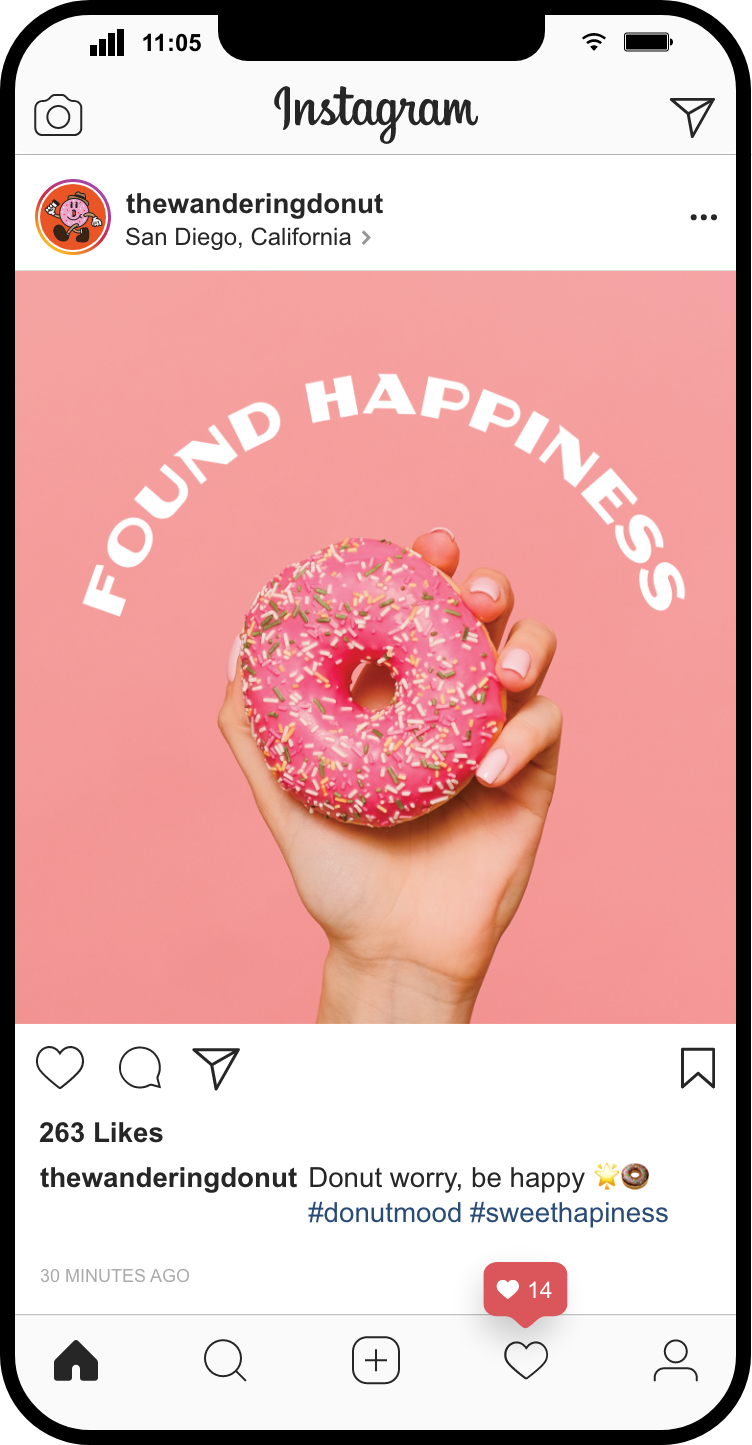
The Wandering Donut needed a brand refresh and identity to complement the new business strategy. Inspired by the retro culture, a lively character mascot was created to be the face of the brand. The new brand refresh adopts wavey elements combined with warm and inviting colors to build a community. The visual language utilizes Reuben, a display sans serif inspired by the days of hand-painted signs, which mimics the immigrant delicatessens in New York. Supporting the vintage display, a friendly but serious slab serif was paired with a clear and flexible typeface.
The Wandering Donut stands for something distinct in a world where everything happens at a breakneck rate, leaving individuals feeling estranged from one another. We firmly believe that the ability to unite people through hard work, community, and tasty, freshly baked donuts. The Wandering Donut understands the value of bringing people together and building a community space. After the pandemic, the business needed to readjust its business plan and location to combat the sudden economic shift.
Solution
The Wandering Donut needed a brand refresh and identity to complement the new business strategy. Inspired by the retro culture, a lively character mascot was created to be the face of the brand. The new brand refresh adopts wavey elements combined with warm and inviting colors to build a community. The visual language utilizes Reuben, a display sans serif inspired by the days of hand-painted signs, which mimics the immigrant delicatessens in New York. Supporting the vintage display, a friendly but serious slab serif was paired with a clear and flexible typeface.
Services
Packaging
Typography
Illustration
Print
Typefaces
Reuben
Ernestine Pro
Tablet Gothic
Packaging
Typography
Illustration
Typefaces
Reuben
Ernestine Pro
Tablet Gothic
Year
2020
2020


Website 2023 © Soloman Garcia